


ing time
The Flash logo history: A concise guide to the Flash symbol
How much do you know about the Flash logo? If you’re a DC fan, you probably know the original Flash logo is slightly different from the new Flash logo. The superhero’s image has updated somewhat since the introduction of a popular TV series.
The Flash logos throughout the years are an excellent insight into how companies can use an attractive image or design to give infinite depth and meaning to a character and brand.
Today, we’ll take a closer look at the Flash logo (both original and new) and how it differentiates the superhero from the rest of the DC landscape.
The Flash symbol: The original Flash logo
We should first note that the Flash symbol is a little different from the Flash logo. The Flash symbol is the specific emblem worn by the superhero “Flash” in the DC Comics universe. Interestingly, the Flash emblem appears on multiple different people identified as the “Flash” character over the years.
The first Flash, Jason Peter “Jay” Garrick, was introduced in Flash Comics #1 in 1940. Jason introduced us to the Flash symbol, which reflects the superhero’s power. The lightning bolt highlights the character’s lightning field and superhuman reflexes.
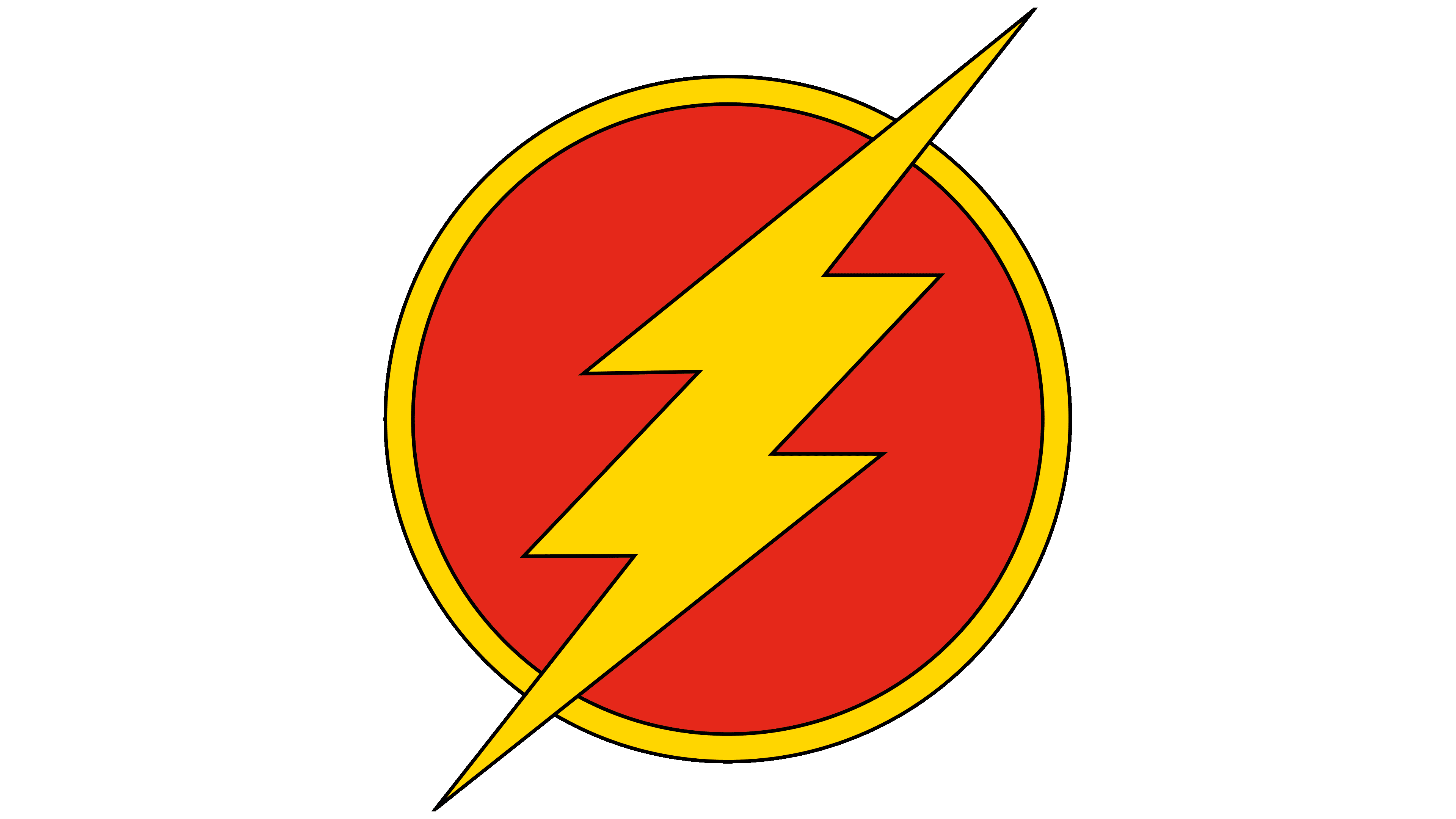
While all of the characters which became “Flash” over the years had a similar symbol, the designs were slightly different. The first Flash only used a single lightning bolt, while the second Flash, Barry Allen, used a yellow lightning bolt in a white circle.
The third Flash, Wallace West, used a similar lightning bolt to his uncle, Barry Allen, while the fourth used more yellow and red. All four characters have also used variants of their logo in different universes and alternate realities.
The modern version of the Flash emblem as we know it today is often shown as part of Justice League marketing for the DC Universe. This variation is much more textured than previous Flash logos and has a metallic essence.
The Flash logos throughout TV history
Looking at the Flash logo history today, we need to consider more than just the emblem familiar in comics and graphic novels. The introduction of the DC Cinematic Universe meant “the Flash ” has also become a famous television character.
While the Flash character in the TV series uses the same lightning bolt imagery, the logo’s overall appearance is a little different from what you might expect looking at the Flash emblem.
2014
The first Flash logo was released with the initial episode in 2014. From then, it was only slightly modified each year, with different coloring elements introduced to highlight the start of a new chapter of the Flash story.
The design includes a three-dimensional logotype in a dark grey metallic. The font leans slightly towards the right, indicating speed and motion. Over the “A,” we see a golden lightning bolt placed where the line would usually be.
The image appears on a dark background with a yellow lightning bolt in the background, apparently created almost entirely out of light.
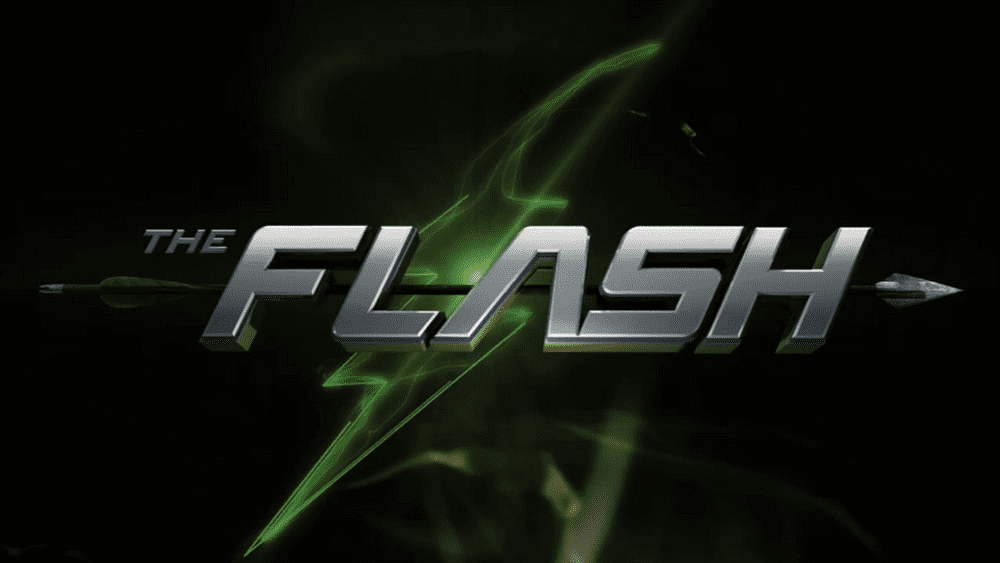
A few months after the original introduction of the Flash, a new logo variation was introduced, with green elements in the design and an arrow behind the primary wordmark. The arrow was intended to highlight the overlap between the “Arrow” television universe and the Flash.
2015
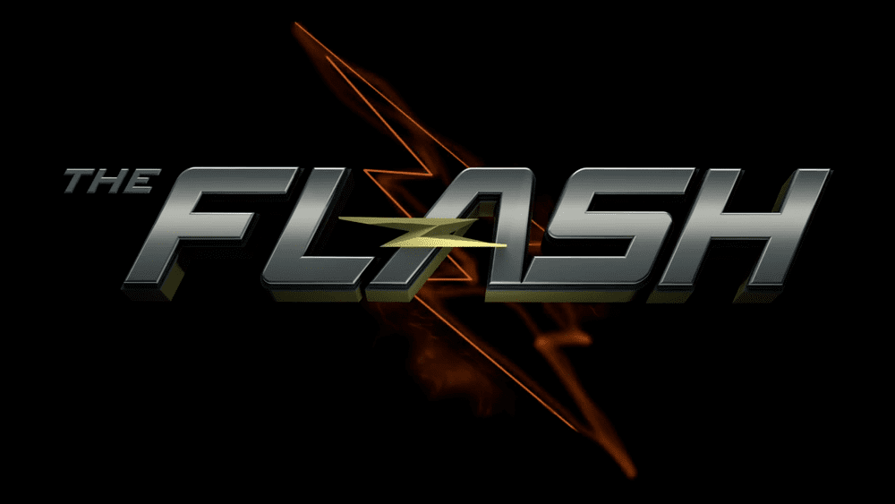
In 2015, the imagery for the Flash logo was updated slightly, with a more refined red lightning bolt in the background instead of yellow illumination. Outside of the change of color palette, the design remained almost exactly the same.
They also used the same green variation of the logo throughout the season towards the end of the year to highlight the connection between the two cinematic entities again.
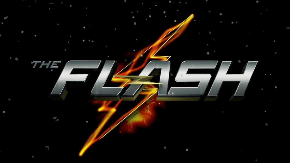
Another variation of the Flash logo was also introduced in 2015, which looked slightly different from the previous version. Instead of a full black background, we got an environment similar to a starry night sky. The lightning bolt also used various orange, yellow, and red colors.
2016
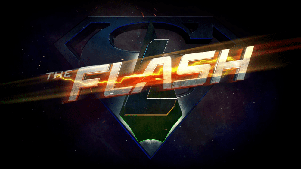
2016 saw an overlap between a “Flash” logo and the Superman logo. The uppercase logotype changed slightly, with more lightning around it and a slight upward tilt towards the end of the word. The yellow, red, and orange coloring infused the wordmark with electricity.
In this example of the Flash logo, we didn’t see the classic lightning bolt in the background, but a similar energy level remained.
2017
In 2017, the Flash logo was refined slightly, with brighter silver lettering in the wordmark and a silver lightning bolt across the “A” rather than gold. The image’s background also changed, embracing the red commonly associated with the Flash character.
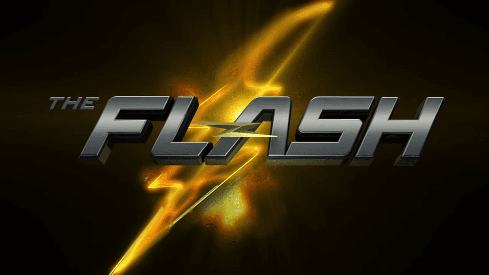
2021
The Flash movie logo builds on the image of the Flash title page for the television show, though it’s a lot more detailed. Here, we see the word “Flash” in textured red and black font with a golden outline, placed over a symbol that looks similar to the Flash lightning bolt.
The colors gold and red heavily draw focus back to the original Flash logo.
What color is the Flash logo?
The Flash logo colors vary depending on whether you’re looking at the emblem for the Flash character or the TV/cinematic logo. Let’s start by looking at the original logo.
The Flash emblem is simply red and gold. While the exact color and hex codes aren’t well-known, we know the most recent variation of the symbol uses various shades and gradients to create a textured effect.
The most recent image from the Flash cinematic universe uses a similar color palette. We see shades of bright and darker red mixed with metallic gold. There are also hints of brighter yellow, helping to draw the mind to ideas of electricity and sunlight.
The imagery in the cinematic logo is a lot more complex from a color perspective than the TV logo, which typically keeps things simple with variations of the same silver wordmark with different colors of background elements.
What font does the Flash logo use?
There’s no specific font or wordmark on the original Flash emblem. Instead, the character relies entirely on the imagery of a lightning bolt to convey meaning. However, we see the use of remarkably similar font styles for the television show and movie universe.
The Flash logo font for the television show uses a custom typeface in sans-serif with bold, slightly stretched letters. The design makes it look like the word is tilting forwards – ready to run.
The Flash cinematic logo uses similar block letters for its wordmark. However, in this case, the letters are far more spread out, giving them a more significant impact. There are also some pointy serifs on the H and the F to give the image a slightly more aggressive vibe.
Exploring the Flash logo today
The Flash logo has gone through a handful of changes over the years. The original Flash logo, a symbol featuring a lightning bolt, has remained a standard component of the character’s image over the years.
While colors, font choices, and designs have evolved, the electrical theme runs through every variation of the Flash symbol.
Here are some handy resources if you’d like to learn a little more about the Flash logo:
Fabrik: A branding agency for our times.

As Fabrik’s creative director, Stephen oversees complex branding programmes. He advises our clients on their tone of voice, creates logos and visual identities and crafts names for companies, products and services. Writing for Brand Fabrik Stephen reflects his love for logo design and visual identity.