


ing time
Nissan logo history: The Nissan symbol meaning
Even if you’re not an expert on the Nissan Motor Corporation, you can probably still recognise the Nissan logo with ease. One of the biggest car manufacturers globally, Nissan ships millions of vehicles worldwide. Read on for the Nissan logo history…
Though somewhat simplistic compared to other automobile logos, the Nissan symbol is effective at capturing the attention of its audience and building awareness for the brand.
You don’t need to be an expert in the automotive industry to recognize a Nissan car, when the name of the company is emblazoned on the badge of every vehicle.
Whether you’re a fan of Nissan motorcars, or you’ve always wanted to know a little more about how major brands choose their logos, you’re in the right place. Today, we’re going to be exploring the heritage and history of the Nissan logo.
Nissan history: The Nissan logo today
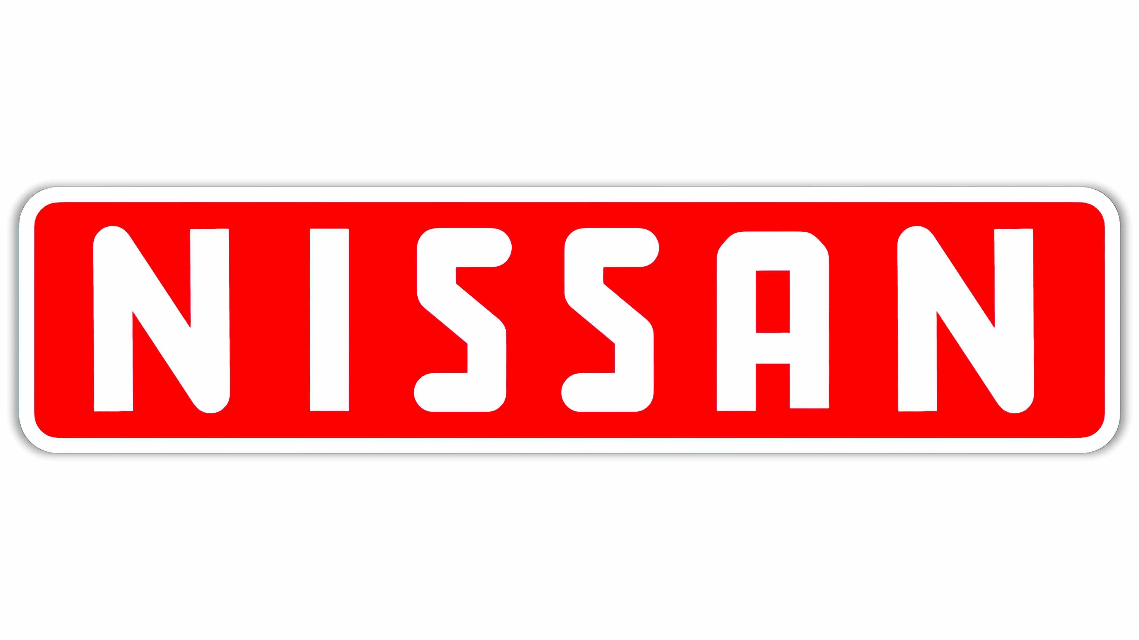
The history of the Nissan logo features a number of variations of the Nissan emblem, all of which feature the shortened name of the brand “Nissan”.
Though the organization has experimented with a range of styles and designs over the years, the current Nissan logo is a modern, attractive image featuring the “Nissan” title written in all-capital sans serif font, and a circular badge.
There are two versions of the Nissan logo currently in circulation.
One is the badge you’re likely to see on the Nissan cars from 2020 and before, with a full chrome circle and a thick silver bar showcasing the “Nissan” wordmark.
The new Nissan design, which replaces the thick silver badge with a simple black outline. In this version of the logo, the circle is separated into two halves by the wordmark in the center.
Both versions of the logo aim to demonstrate modernity, creativity, and inclusivity. The secondary design is most commonly used in branding and marketing initiatives for the increasingly digital presence of the Nissan company.

Nissan: Brand overview
| Founded: | 1933 |
| Founder: | Masujiro Hashimoto |
| Headquarters: | Yokohama, Japan |
| Website: | www.nissanusa.com |
| Logo downloads: |
The Nissan Company was officially founded in 1933, more than 87 years ago at the time of writing. The brand traces its origins back to some of the earliest days of automobile manufacturing, and today is one of the biggest motoring companies in the world.
Nissan has been part of the Renault-Nissan-Mitsubishi alliance since the end of 1999, and it’s currently the 6th largest automaker in the world.
In 2014, Nissan announced it had hit the top spot as the largest car manufacturer in North America. By 2018, Nissan had earned the position of the largest electric vehicle manufacturer worldwide, with global sales of more than 320,000 fully-electrical vehicles.
The increasingly modern identity of Nissan is clearly reflected in the company’s choice of symbol.
Nissan car logo evolution: Nissan logos through history
The Nissan car symbol has seen several changes over the years. The company always aimed to maintain a clean, easy-to-recognize image with its emblems, which may be why many of the elements of the old Nissan logo, and the new Nissan logo are the same.
1933
Despite appearing decades ago, the original Nissan logo was a sleek and modern symbol, designed in red, white and blue. The red circle was representative of the sun, while the blue rectangle was meant to indicate reliability.
The wordmark for Nissan was written in all caps, with a bold sans-serif type.
1940
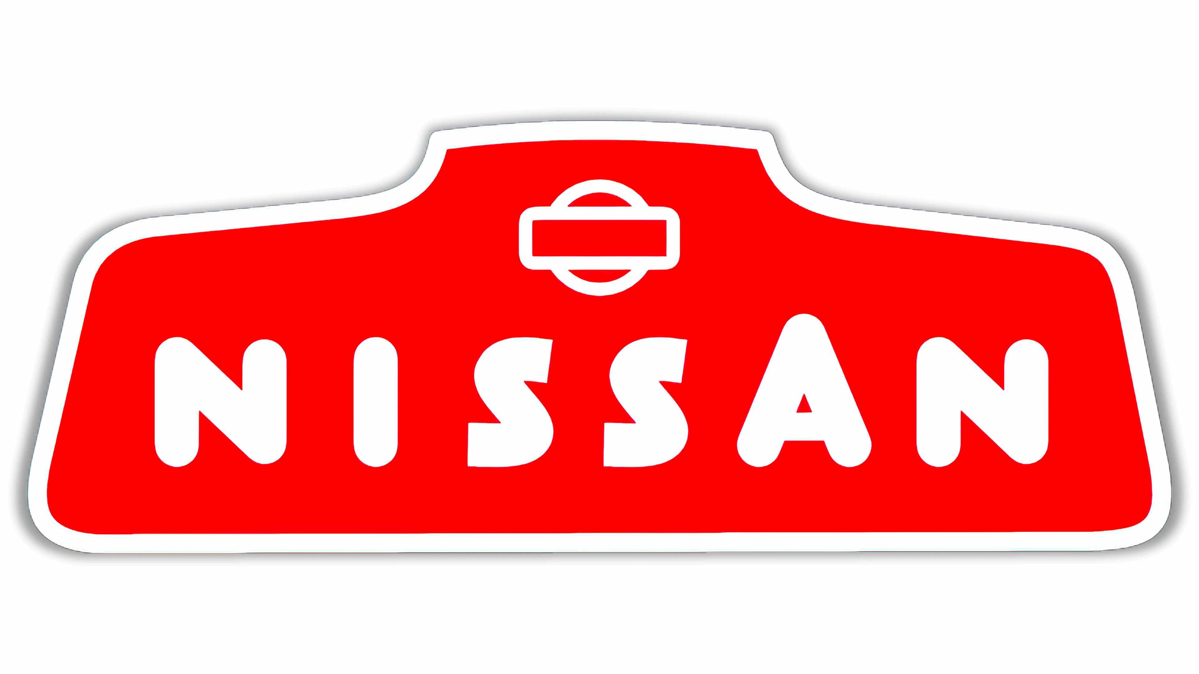
The first Nissan logo change happened in 1940, when the company began experimenting with colors and shapes. The blue rectangle was removed, and Nissan embraced an odd geometric shape, similar to the front portion of a car.
The wordmark was executed in a hand-drawn, friendly typeface, with an enlarged letter “A”. the “rising sun” emblem previously used by Nissan also appeared in this version of the logo, just above the wordmark.
1950
The Nissan emblem changed again in the 1950s, during which time the company simplified its image to feature a wordmark on a simple red, rectangular background. The red rectangle featured curved edges and a thick white border, matching the color of the brand name.
The font here was stronger and more angular, and all letters were the same size.
During 1959, Nissan also experimented with a different version of this logo, in which the letters of “Nissan” were enlarged to hang over the rectangular background. This Nissan symbol only remained in use for around a year.
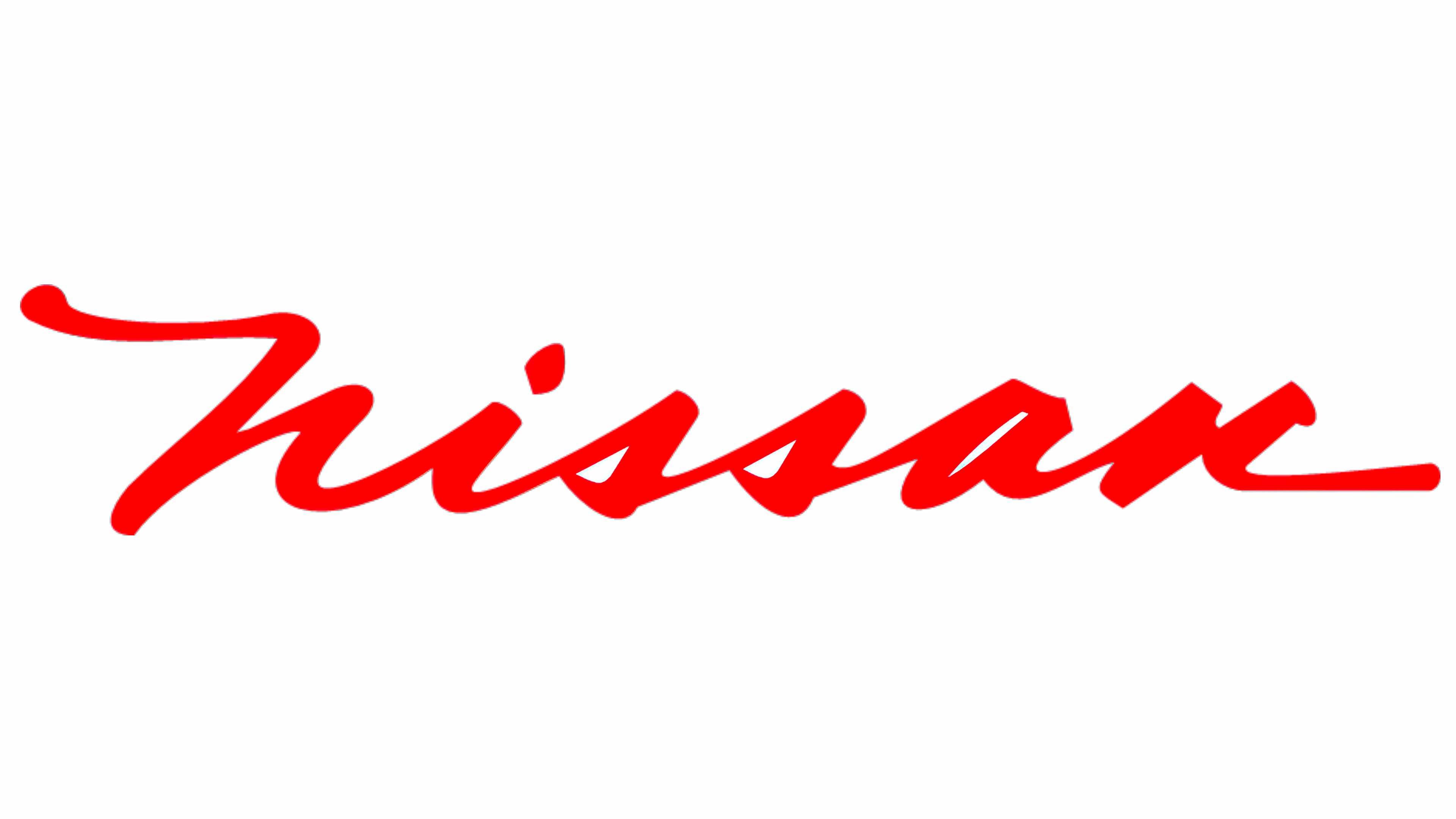
1960
Experimenting once again with typography, Nissan introduced a completely different form of the Nissan logo font in 1960. Here, we saw a sentence-case version of the word “Nissan” written in italic, cursive typography.
The red wordmark sat atop a white background for a minimalist look.
When placed on cars, the word was written in silver, to help it appear as stylish and expensive as possible. This unique iteration of Nissan’s brand identity was intended to convey elegance.
1967
Throughout the end of the 1960s and the beginning of the 1970s, Nissan explored a couple of additional typography choices for its logo. In 1970, the italicized logo abandoned its cursive elements and took on a broader, bolder appearance, improving legibility.
Nissan also replaced the bright red coloring for a brown color palette.
Nissan quickly replaced this image with another alternative, this time featuring silver font on a black background, with a thin silver border. The font in this Nissan logo choice was completely different again, this time written in all-capitals, with a serif finish.
1983
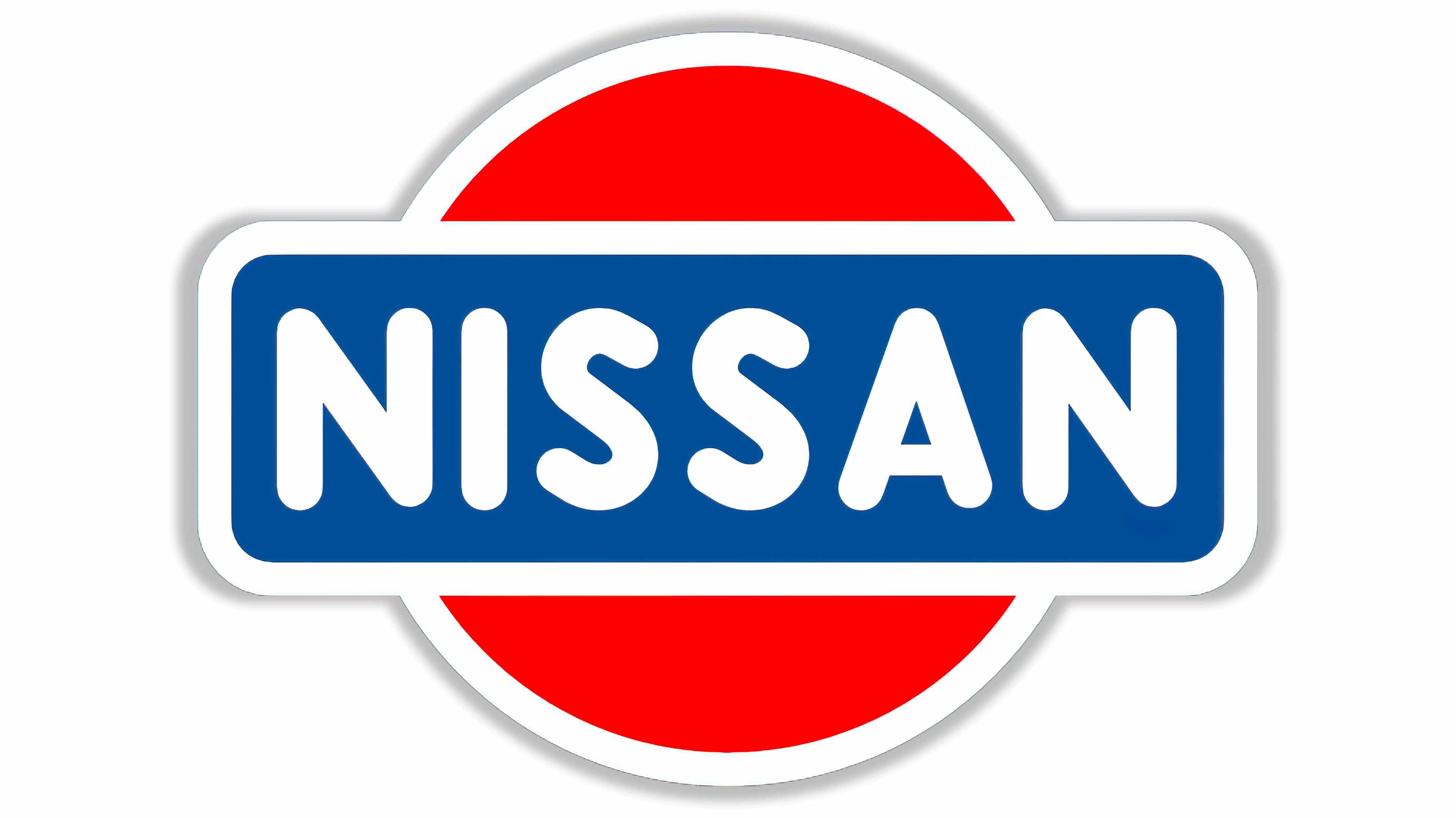
In 1983, after what appeared to be a decades-long identity crisis, Nissan returned to its roots, restoring the “rising sun logo”, alongside a much larger wordmark, written in sans-serif all-capital type. The lettering here is strong and confident, and the color palette of red, white, and blue returned.
2001
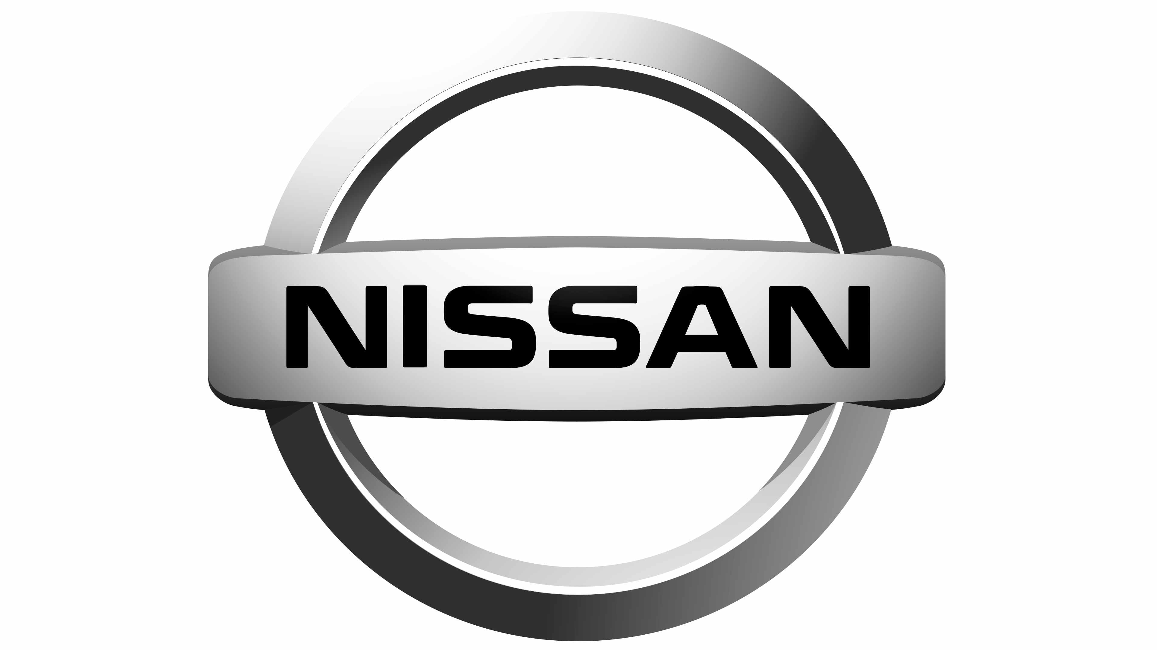
In 2001, Nissan simplified and updated its logo for a modern audience, introducing the silver version of the logo most of us know today. This image is still present on some Nissan cars, showing the title “Nissan” on a silver banner over a matching silver circle.
2020
In 2020, a minimalist version of the previous Nissan logo was introduced. The font is slightly thinner here, and the circular border surrounding the wordmark is much sharper.
The circle is split into two distinct sections by the name “Nissan” which uses the whitespace in the logo as a kind of banner.
Various versions of this logo have since appeared in a multitude of marketing campaigns. There are 3D versions with shadows and depth, and multiple Nissan logos in different colors, including the iconic red which used to be linked to the brand.
Nissan symbol meaning: The Nissan symbol
The Nissan symbol is very similar in style to the emblem of the company’s sister brand, Datsun. The circle behind the word “Nissan” isn’t just a classic image for a car brand; it’s also intended to represent the rising sun – a heraldic symbol in Japan.
Today, the newest version of the Nissan logo is intended to look like a much simpler version of the image most people knew in 2020. Though the current version of the logo is certainly far more modern than the company’s original logo, it’s easy to see the connection between the two.
The visual identity today immediately conjures ideas of creativity, community, and innovation, particularly when linked to the image of the Japanese rising sun.
Nissan logo colors: The color of the Nissan logo
Officially, the Nissan logo color is simply a black image on a white background. However, there are a number of Nissan colors owned by the brand.
The most common shades you’ll find associated with Nissan on the company’s website include:
Red
HEX color: #C61935
RGB color: rgb(198, 25, 53)
Black
HEX color: #000000
RGB color: rgb(0, 0, 0)
Grey
HEX color: #D8D9DB
RGB color: rgb(216, 217, 219)
What font is the Nissan logo?
As you can see in our history of the Nissan logo above, the Nissan font is one of the major design elements the company changed a number of times over the years. The Nissan logo font has evolved through a host of different typefaces, from friendly handwritten styles to italic masterpieces.
The current font of the Nissan logo is a custom-made brand typography, created in a geometric sans-serif design. Usually, the word “Nissan” is written in black for branding purposes.
Celebrating the Nissan logo today
The Nissan logo today is one of the best-known images in the automotive industry. The chances are you can easily spot a Nissan car, regardless of whether you’re a fan of the brand, thanks to the iconic Nissan symbol.
If you’d like to learn more about some of the amazing logos shaping our world, check out some of the other fantastic Logofiles here on Brand Fabrik.
Now read these:
—Which car companies own which car brand?
—Famous car brands, their names and logos
—The ultimate list of French car brand logos
—The 50 best-known car logos with wings
—The definitive guide to German car logos
—Famous car logos and emblems with stars
—Top American car brands and their logos
—Your ultimate guide to Italian car brands
—American car companies that went bust
—The conclusive guide to British car logos
—The essential list of Japanese car logos
—A decisive guide to car logos with circles
Fabrik: A branding agency for our times.

As Fabrik’s creative director, Stephen oversees complex branding programmes. He advises our clients on their tone of voice, creates logos and visual identities and crafts names for companies, products and services. Writing for Brand Fabrik Stephen reflects his love for logo design and visual identity.