


ing time
Godiva logo and the history of Godiva Chocolate
If you’re a fan of luxury chocolate (like many people), you’re probably familiar with the Godiva chocolate logo. Easily recognizable across the globe, the Godiva logo has become a symbol of quality, indulgence, and impeccable taste for lovers of the treat.
While Godiva logo history isn’t as complex as the history of some other confectionary companies, it’s still a story worth exploring. Over almost 100 years, Godiva has only ever had two official logos for its chocolate creations.
That’s quite the impressive feat.
Today, we’re going to take you on a journey into the world of the incredible Godiva brand and its unique visual identity.
Here’s everything you need to know about Godiva chocolate…
Godiva Chocolate history
Before we dive into a closer look at Godiva logos, let’s begin with an exploration into the history of Godiva chocolate. Godiva history began in Brussels, Belgium, during 1926. The chocolate was created by the Draps family, who opened their very first shop in Grand Place in Brussels.
The name of Godiva was chosen to honor Lady Godiva, the noblewoman best known for riding throughout the streets naked on a horse. Apparently, Godiva rode her horse through the town naked to convince her husband to lower taxes.
The Godiva Chocolate logo is also based on this iconic figure and has always featured a woman with flowing hair on the back of a stallion.
Godiva’s first store to open outside of Belgium appeared in Paris, in the Rue Saint Honore during 1958. By 1966, the products of Godiva Chocolate had reached the United States, where they rapidly gained attention throughout several shopping centers.
According to the Godiva website today there are more than 600 boutiques selling Godiva Chocolate, and the company has a presence in more than 100 countries worldwide.
Where did Godiva Chocolate originate?
Godiva Chocolate began life in Brussels, Belgium, before eventually expanding around the world.
Who owns Godiva Chocolate?
Currently, Godiva Chocolate is jointly owned by South Korean equity company MBK partners, and Turkish conglomerate Yildiz Holding.
Where is Godiva Chocolate made?
Though Godiva Chocolate originated as one of the world’s top Belgian chocolate companies, it now has factories in locations around the world. Godiva factories are active in Reading, Pennsylvania, Turkey, and Brussels.
Why is Godiva chocolate named Godiva?
Godiva history and the Godiva Chocolate logo center largely around the tale of Lady Godiva, who inspired the family behind the brand, the Draps.
In 1926, Pierre Draps Sr began making pralines in his confectionary store in Brussels, with his young sons Joseph, Pierre Jr, and Francois all joining the business from an early age.
According to the company’s brand history, the family was strongly inspired by the legend of Lady Godiva, who they believed embodied all of the essential characteristics of their brand.
The values of Lady Godiva the chocolate company hopes to convey include generosity, creativity, and boldness.
What is the symbol on Godiva Chocolate?
Since the name of the Godiva chocolate brand is based on the iconic noblewoman, Lady Godiva, it’s little surprise the symbol of the company is based on the same person. The Godiva branding is built around the image of Godiva, riding her horse throughout town for justice.
Godiva branding
As mentioned above, though the Godiva Chocolate company has been around for almost 100 years at the time of writing, the branding has changed very little. The Godiva brand is a strong identity built on a sense of respect for a real historical figure.
As such, there have only been two official Godiva logos throughout the brand’s existence.
1926
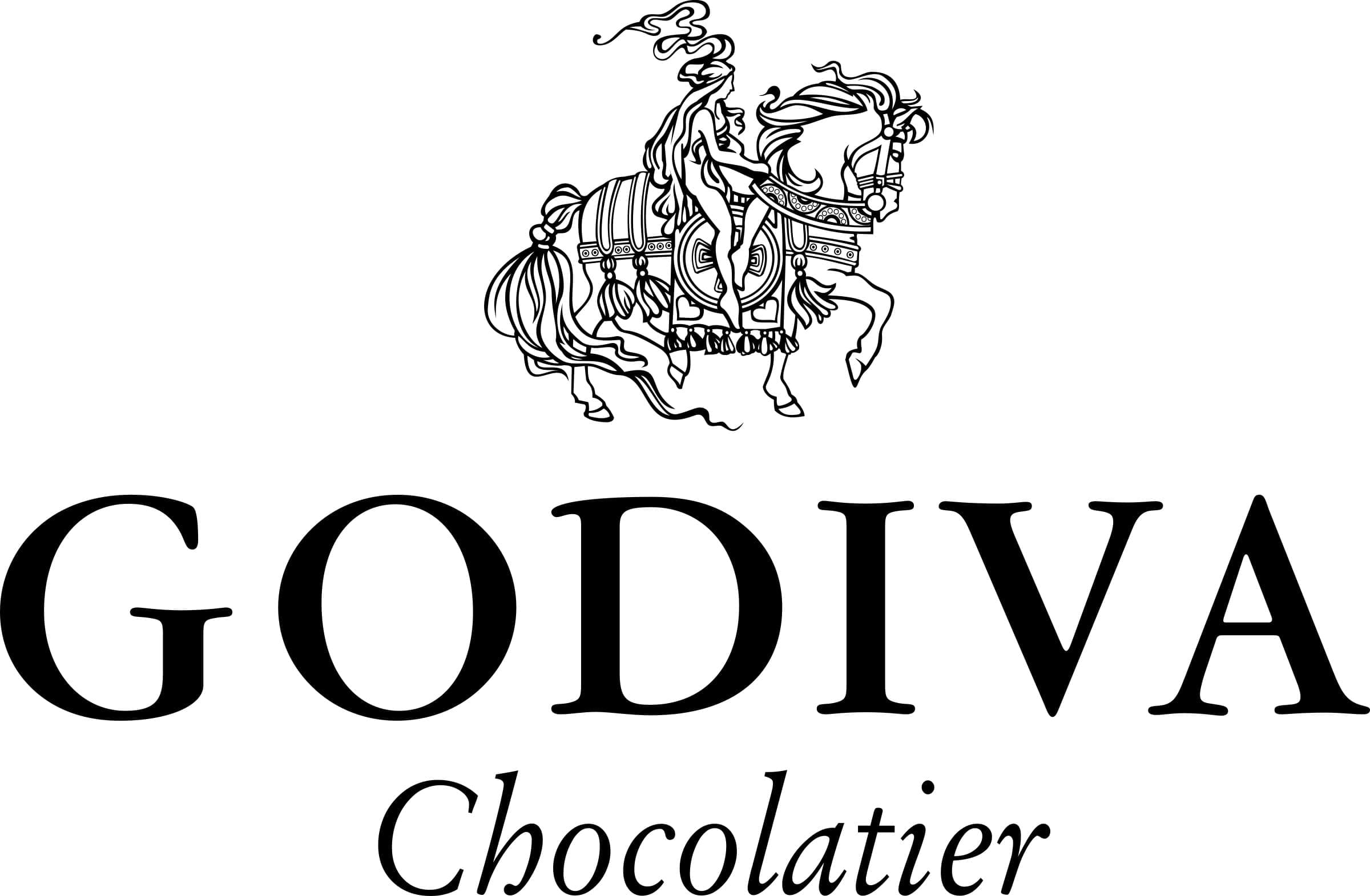
The first logo for Godiva chocolate was introduced in 1926, when the company first began producing chocolates in Brussels. This logo was a lot more detailed than the image many of us are familiar with today, but it maintains a lot of the same components.
The initial Godiva badge stayed with the brand for around 80 years. Depicted in black and white, the image included an elegant graphic of the Lady Godiva, with her lustrous flowing hair, and a beautifully dressed horse.
This version of the logo placed a lot of detail on both the picture of the horse and Godiva herself. The brand wordmark underneath the initial Godiva logo is similar in style to the current inscription.
However, the first design was written in a more distinct serif font. Underneath the name “Godiva” we can see the defining word “Chocolatier”.
2005
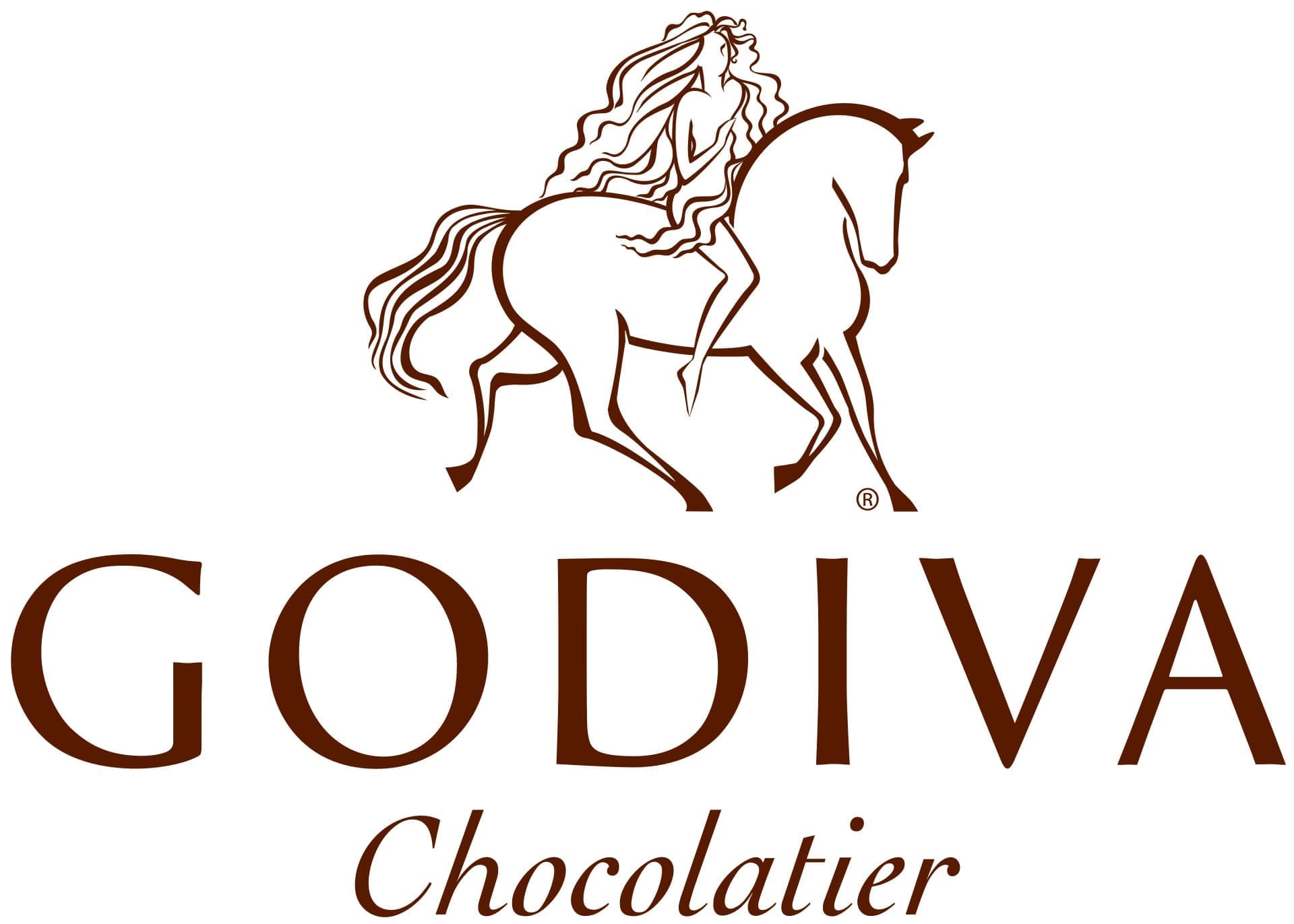
The most recent Godiva logo was introduced in 2005, as a modernized and simplified version of the initial logo. This version of the logo, we still see the image of Lady Godiva, though much of the detail is removed.
The horse, like lady Godiva is naked in this logo variation, and seems to be moving in a somewhat more subdued way.
There’s a lot of emphasis on Godiva’s flowing hair in this version of the brand image too, which might be intended to convey the flowing nature of liquid chocolate. Though there are still slight serifs on the newer version of the Godiva logo, they’re almost imperceptible today.
The wordmark is still written in all capitals, followed by the inscription of “Chocolatier” in italic sentence-case lettering underneath. Another significant change in this logo is the decision to switch from black and white to a chocolate brown shade.
Godiva logo elements: Font and colors
The emotional and engaging nature of the Godiva logo is perfect for a luxury chocolatier, attempting to convey a sense of history and heritage in its image. The image of the noblewoman from the 11th century offers an excellent insight into the values of the company, and where the name came from.
Today’s Godiva logo is sleek, elegant, and eye-catching, combining an unforgettable image with a wordmark, and a smaller inscription beneath.
You can find some Godiva brand elements here:
What font does the Godiva Chocolate logo use?
The Godiva logo font is an elegant, modern font, with extremely subtle serifs on the “G” at the beginning of the brand mark. This beautiful font is clean, sophisticated, and easy to read. It was designed specifically for the Godiva brand.
According to some font and typography experts, the Godiva logo font is quite similar in style to the Classico Regular font, produced by Hermann Zapf.
What color is the Godiva logo?
For around 80 years, the Godiva logo colors remained black and white, offering a simple and elegant edge to the company’s branding. In 2005, the official Godiva logo color changed to a chocolate brown shade – a color commonly used in the chocolatier industry.
The coloring today is intended to remind the consumer of the delicious, silken chocolate pieces sold by the company. The HEX for the logo is 452822.
Celebrating the Godiva logo today
The Godiva chocolate logo is an excellent example of how a company can be inspired by a single figure. The Godiva logo, its name, and even the company’s entire brand identity is built around the legend of Lady Godiva.
While the Godiva logo hasn’t changed much over the years, the history and heritage behind the chocolate logo makes it one of the most emotional, and compelling images in the confectionary landscape.
Remember, you can always check out more Logofiles on Brand Fabrik!
Fabrik: A branding agency for our times.

As Fabrik’s creative director, Stephen oversees complex branding programmes. He advises our clients on their tone of voice, creates logos and visual identities and crafts names for companies, products and services. Writing for Brand Fabrik Stephen reflects his love for logo design and visual identity.