


ing time
Exploring the Demon Slayer logo and symbol
How much do you know about the Demon Slayer logo? While the Demon Slayer symbol might not have been around for a particularly long time, the image has still captured the attention of countless Manga fans around the world.
Today, Demon Slayer’s visual identity has become a global phenomenon.
Easily recognized as one of the fastest-growing Manga series’ of the last few years, the Demon Slayer brand is quickly gaining weight. For some people, the Demon Slayer symbol is just as recognizable as other iconic images from the industry, like the Naruto logo.
Today, we’re going to be taking a closer look at the story of the Demon Slayer brand and providing an insight into the meaning of the iconic logo behind it.
The Demon Slayer symbol: About Demon Slayer
Before we start looking at Demon Slayer logos, let’s begin with an introduction to the manga itself.
Demon Slayer is a Japanese manga series illustrated and written by Koyoharu Gotouge. In recent years, the manga has expanded into different mediums, including a 26-episode name television series produced by Ufotable.
Demon Slayer follows the story of teenage Tanjiro Kamado on his journey to become a demon slayer after his younger sister is turned into a demon, and his family is slaughtered. Like many popular manga series’, the story first appeared in the Weekly Shonen Jump from 2016 to 2020.
Over the years, the engaging story and unique characters of Demon Slayer have helped the Demon Slayer logo to expand all around the world. As of February 2021, the manga had more than 150 million copies in circulation, making it the eight top-selling manga series of all time.
Notably, the anime series has received numerous awards, and is now considered one of the best anime series of the 2010s. Both the anime and manga series have received critical acclaim.
Demon Slayer logo history
Unlike many other anime and manga series, there haven’t been a large number of Demon Slayer logo variations. Rather, the brand has continued to use the same official image since 2016.
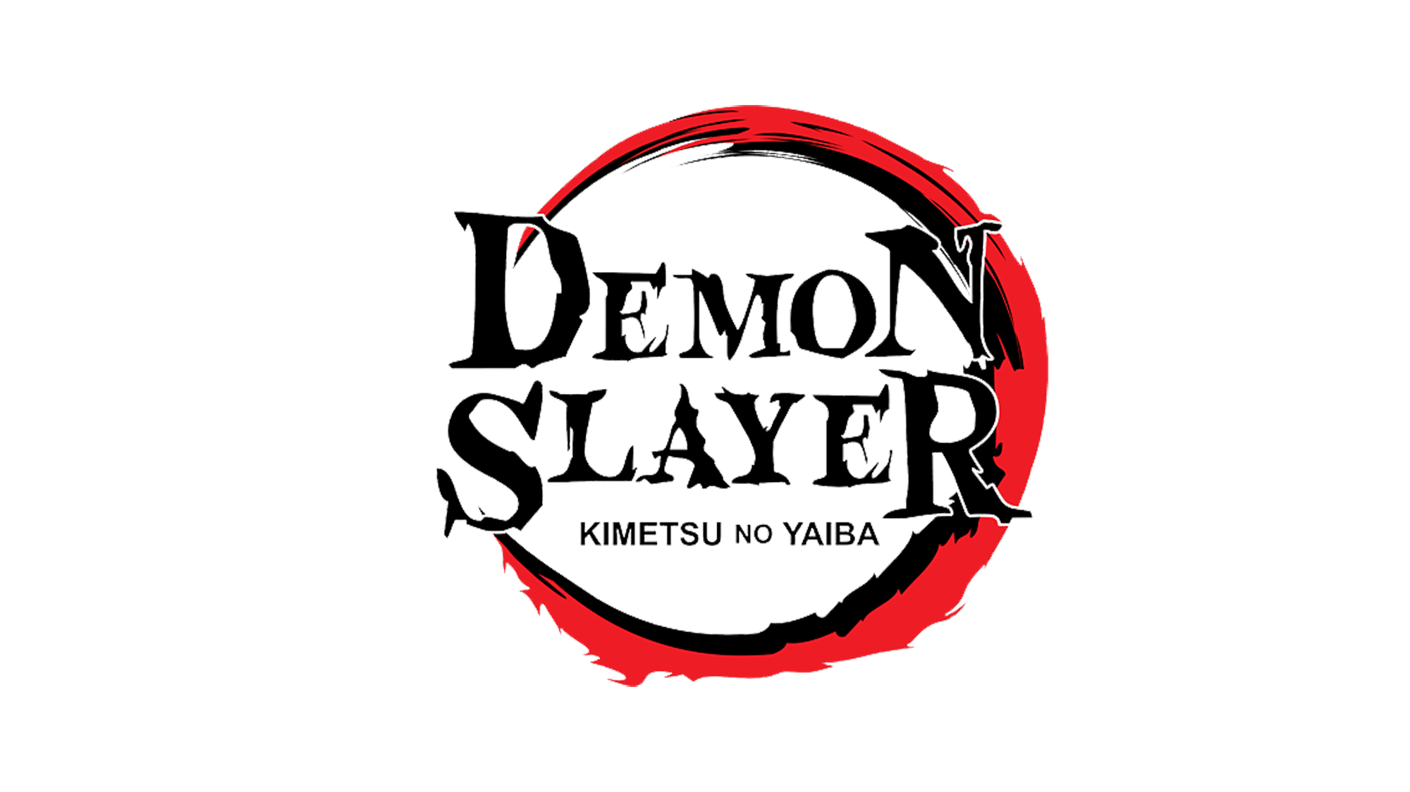
The image depicts a crimson crescent with an inner black layer, and an opening towards the left. The design of the crescent is jagged and raw, similar to a wound from a claw, or a slash across a piece of fabric. The “Demon Slayer” wordmark is equally jagged and tattered.
Though written in serif letters to depict history and heritage, the wordmark has a raw edge to it, particularly when depicted in all uppercase. The Japanese title “Kimetsu No Yaiba” appears below this logo, which means “Blade of Demon Destruction”.
A similar version of this logo exists for the Japanese market. The design is almost exactly the same, except for the Japanese characters, and the placement of the subtitle above the wordmark.
Notably, the Kanji logo features a made-up word specifically for this show, which has made it notoriously difficult for people to translate in the past.
Demon Slayer symbol
Aside from the Demon Slayer logo, there’s also a Demon Slayer symbol commonly associated with the anime. This is a Kanji letter that appears on Demon Slayer uniforms, reading “METSU.”
The symbol, according to experts, doesn’t technically stand for “Demon Slayer,” but it does mean something similar to “Japanese demon” and “Annihilate.”
This symbol is designed to accompany the unique Demon Slayer logo in a lot of the branding and marketing campaigns for the series. The symbol has become almost as well-known as the official Demon Slayer logo itself.
According to fans, there was another option for the manga title: “Kisatsu No Yaiba”, which means “to kill”. The author said he chose “Kimetsu” instead, because Kisatu was too straight and stimulating.
However, the word Kisatsu appears in the story itself.
Elements of the Demon Slayer logo
The Demon Slayer logo is a simple but effective icon for a famous manga and anime show. There’s a clear sense of foreboding in the various elements used to bring this image together. The colors of black and red can be associated with things like passion and sophistication in the branding world.
However, in this case, they seem more closely connected with demons, blood, and danger.
The design of the ragged serif letters in the Demon Slayer logo are particularly telling. The design makes it look like the letters have been scratched into a piece of parchment. The image looks somehow ancient and mysterious at the same time.
The various elements of the Demon Slayer logo come together to create a darker, grungier brand image for the series – ideal when you consider the story itself. The Demon Slayer anime and manga isn’t exactly a light-hearted narrative.
What color is the Demon Slayer logo?
While there are no official hex codes or CMYK colors for the Demon Slayer logo on the web today, we can see clearly the design is split into two distinct colors: black and crimson.
The bright red Demon Slayer logo color is designed to be harsh and eye-catching. For the purpose of this brand, the color red can be associated with everything from the traditional image of a demon, with its red skin, to the colors of blood and fire.
The black elements of the logo add depth to the image, while increasing the mysterious nature of the design. The use of black also draws the mind to more traditional images, like black ink scraped across parchment.
While the Demon Slayer logo colors are simple, they just the right impact on their audience.
What font does the Demon Slayer logo use?
The Demon Slayer logo font is unique to the brand and created specifically for the series. The design is similar to a number of dynamic, calligraphic Japanese fonts produced over the years.
The font is attractive in its hand-written styling, which brings an edge of humanity to a serif-style type. The sharp movement of the letters also makes them appear strong and bold, with an element of violence to some of the edges.
The letters seem to be scratched into the surface of whatever medium might be showing the logo, which draws attention to the harsh narrative of the series.
You can find a number of similar Demon Slayer font elements here.
Here are some additional Demon Slayer resources:
Celebrating the Demon Slayer logo
The Demon Slayer logo might be simple compared to some of the other anime and manga logos on the market, but it’s extremely effective. The careful use of shapes like the crescent reminds us of the moon, and the shape a claw might make when scratching against a surface.
The use of harsh coloring like red and black are perfect for a somewhat dark and violent story, while the serif elements help to remind us of the heritage that goes into the Demon Slayer title.
Don’t forget, you can learn more about some of the most well-known logos in the world today by checking out some of our other logo files.
Fabrik: A branding agency for our times.

As Fabrik’s creative director, Stephen oversees complex branding programmes. He advises our clients on their tone of voice, creates logos and visual identities and crafts names for companies, products and services. Writing for Brand Fabrik Stephen reflects his love for logo design and visual identity.