


ing time
The Conservative Party logo history
Conservative Party logo history might not go back as far as some of the other political symbols in the world today, but this doesn’t make it any less interesting. The symbol of the Conservative Party, just like any brand emblem, has evolved over the years in an attempt to capture the hearts of followers.
Whether you consider yourself a Conservative Party supporter or not, you’re probably somewhat familiar with the Conservative Party symbol.
The Conservative tree logo sparked significant controversy when it first emerged in 2006. Prior, the image of a burning torch left many political fans discussing their theories about the meaning of the emblem.
Today, we’re going to take a closer look at the Conservative logo, and how the image has changed since the current version of the Party began in 1912.
The old Conservative Party logo: The Tory logo
Officially, the “original” Conservative Party first began in the UK during 1834, more than 187 years ago. The “current form” of the Conservative Party, created when the Liberal Unionist Party merged with the Tories began again in 1912.
This was when the Tories became the main rival of the Labour Party in the UK.
Throughout almost two centuries of history in total, however, the Conservative Party logo has rarely gained much attention. Search through the annals of political history in the UK and you won’t find much record of an official Conservative logo before 1982.
For most of Tory history, the defining feature of the Party has instead been the color blue. Specifically, the Tory identity, and the current logo is linked to the shade “Conservative Party blue”.
In the past, the icon also includes the other shades of the Union Jack: red and white.
If you’re looking for your own version of the Conservative logo, here are some resources to help:
Conservative Party logo vector
The Conservative torch logo
The old Conservative Party logo you may be familiar with today is the “Conservative torch logo”. The first version of this symbol emerged in 1982, with a slightly different shade of blue to the color we know today, as well as red and white stripes underneath the emblem’s flame.
The 1982 Tory Party logo was simple enough, showcasing a broad triangle pointing downwards, a series of three stripes, and a shape meant to represent a flame.
The words “Conservative Party” were used around the torch in the shape of a circle. In this logo, the font was a simple, serif typography, similar to Times New Roman.
1989
The symbol of the Conservative Party remained the burning torch for a number of years, though the design changed slightly through the decades.
In 1989, the image evolved to feature a hand holding a torch. The torch was a lot more refined in this image, with greater detail, and a wider selection of shapes. While the hand and base of the torch were drawn in blue, the flame was displayed in red and white.
The shape of the flame changed here too, looking almost like a flowing mane of hair.
The words “Conservative Party” were switched to just the word “Conservative” in all capitals, written in a sans-serif font.
2000
For the new millennium, the Conservative Party changed its logo again, this time showing more of the arm and sleeve of the person holding the torch. The rolled-up sleeve symbolised an idea of “getting things done” for the country.
The majority of the design stayed the same, though various aspects were refined to make the symbol cleaner.
With this version of the Tory Party logo, the word “Conservative” appeared in a white font on a blue rectangular background. The wordmark still featured all capital letters, but this time in bolder type.
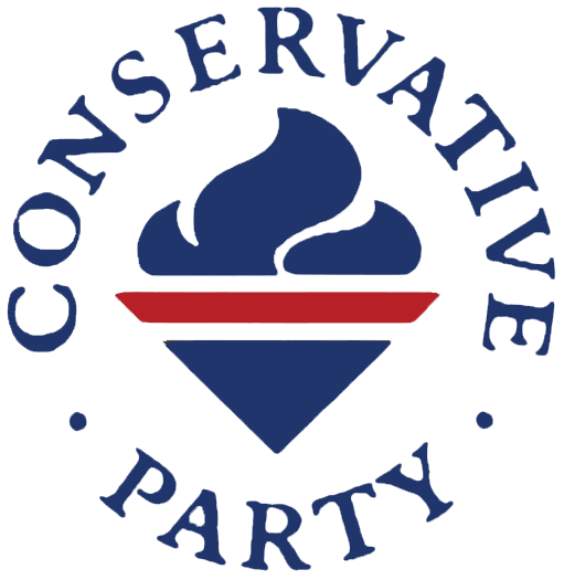
The Conservative tree logo
The symbol often described as the “new Conservative Party logo”, though it’s been around for some time now, is the tree logo. This image was met with some controversy in the UK, as many people felt the design was overly simplistic, informal, and underwhelming.
2006
The first iteration of the Conservative Party logo using the tree featured the word “Conservatives” in a sans-serif, sentence-type font, placed next to the image of a tree. The color blue often associated with the Tories changed drastically here, and the red and white elements of previous designs disappeared.
To help identify the squiggled shape next to the word “Conservatives” as a tree, the top part of the image was drawn in green. The Conservatives claimed this icon represented stability, strength and growth for the political Party.
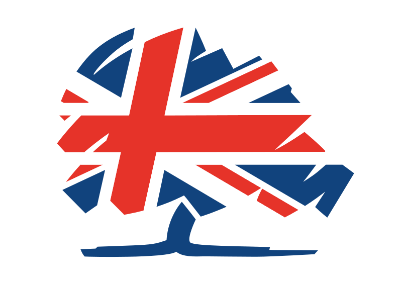
2010
Following an overwhelmingly negative response to their new tree logo, the Conservatives waited until 2010 to update the symbol again. This time, the image removed the word “Conservatives” and focused entirely on the scribbled tree image.
Perhaps paying homage to the old Union Jack elements in previous Conservative Party logo history, the image now had its own Union Jack emblazoned into the tree.
2019
In 2019, the Conservatives simplified their image again, returning to the roots of the Tory logo with the focus on the blue coloring. This light blue shade was a lot different from the previous Tory Party logo color choices, but it did help the image to appear friendlier.
For this version of the logo, the Tories returned the “Conservatives” wordmark, written in a simple sans-serif font alongside the image of the tree.
In 2020, the Party symbol was refined further, minimising some of the “haphazard” elements of the tree. This slightly cleaner logo is now the official image for the Conservative Party.
The elements of the Tory logo
The Conservative Party logo today is a simple, but effective image, designed to highlight thoughts of growth and stability. The use of a very straightforward design with just one primary color helps to make the image more memorable to a wide range of potential voters.
What font does the Conservative Party logo use?
The Conservative Party logo font has changed a few times over the years. Today, the typography is a very simple sans-serif choice, written in standard sentence case. The font, though designed specifically for the Conservative Party, looks similar to Arial or Calibri.
What colour is the Conservative Party logo?
The Conservative Party logo colors used to be red, white and blue, the same colors as the UK Union Jack. However, when Labour started using similar color schemes, the two political parties altered their branding efforts.
Labour became associated with red, while the Conservatives took blue.
Blue is the shade most commonly associated with Conservative elsewhere in the world, too, such as in the United States. The initial Conservative Party logo color was a lot darker than the one most people know today.
Currently, the color is Conservative blue:
HEX: #0087DC
RGB: 0, 135, 220
CMYK: 100%, 39%, 0%, 14%
Whatever your political persuasion, there’s no denying the Conservative Party today does its job. The image is memorable, unique, and effective at driving conversation, even among non-Tory voters.
Fabrik: A branding agency for our times.

As Fabrik’s creative director, Stephen oversees complex branding programmes. He advises our clients on their tone of voice, creates logos and visual identities and crafts names for companies, products and services. Writing for Brand Fabrik Stephen reflects his love for logo design and visual identity.